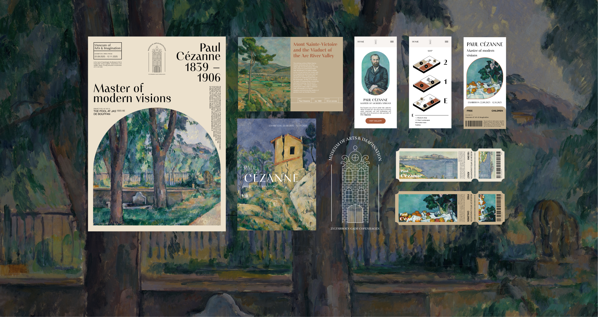
This project consists of material made for an exhibition of the artist Paul Cézanne at a fictional museum in Copenhagen, Denmark. I wanted to explore the combination of graphic design in print and UX/UI design in the digital elements and therefore started this project. The aim was to create a complete set of materials for the exhibition, including posters, brochures, tickets, and digital elements. The choice of Paul Cézanne as the artist was partly because of his beautiful artworks but also because his works are no longer under copyright protection.
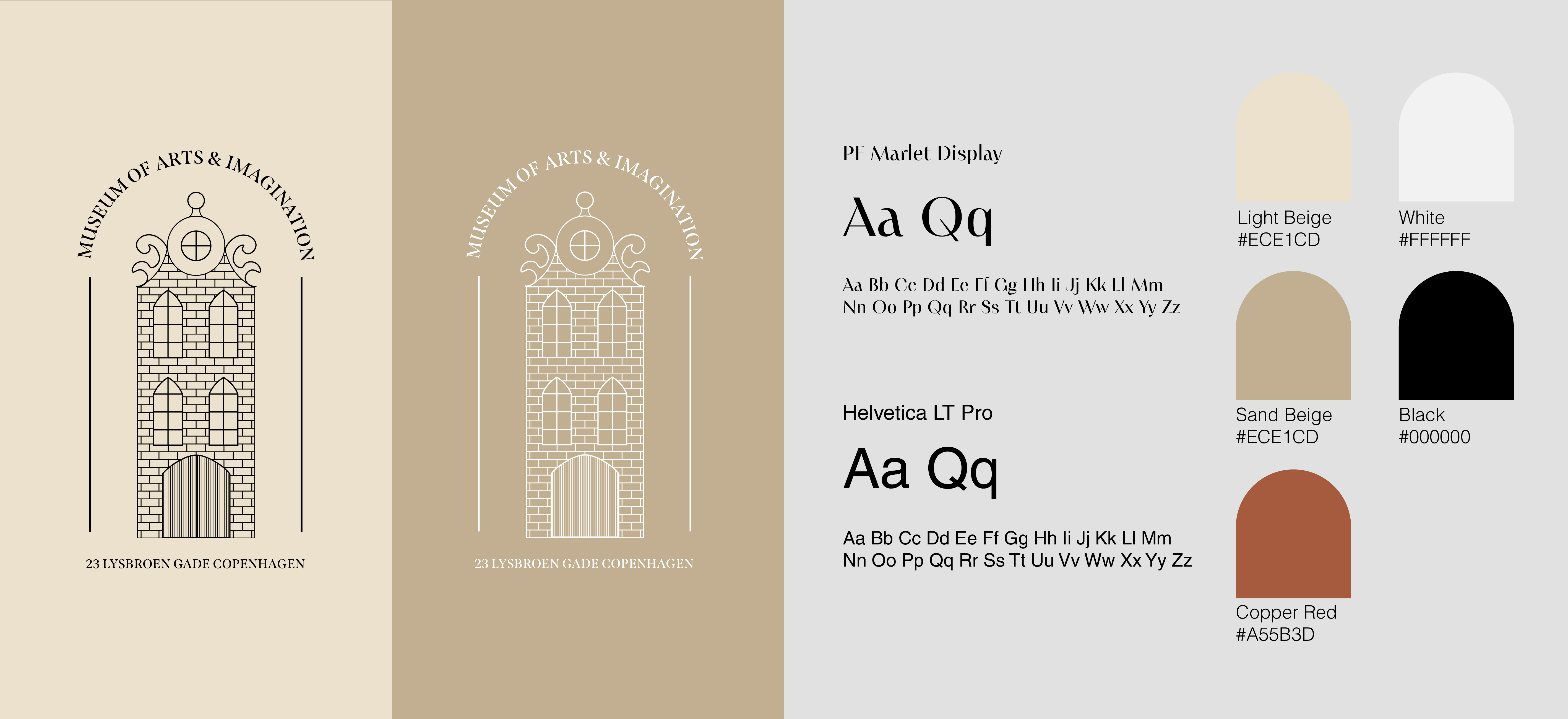
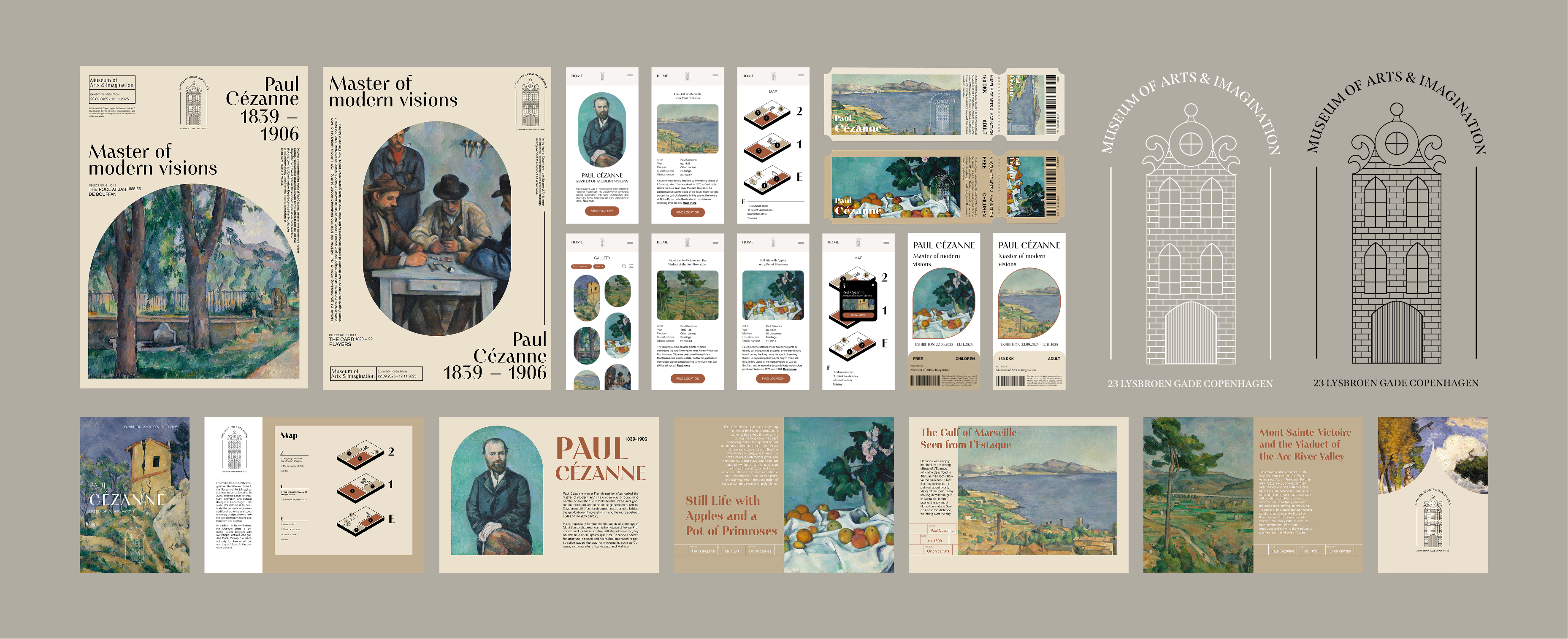
To create a sense of something classical and traditional,yet with a modern and unique touch, the typeface PF Marlet Display was chosen for headings and similar elements. Helvetica was selected for body text because it is a simple sans serif typeface that remains highly legible in both print and digital media. The color scheme with beige, brown and red tones was selected to echo the earthy and subdued shades of the late 1800s, connecting the design to Cézanne’s time. I also created a logotype for the museum in Illustrator and it was inspired by the old town houses that can be found in Copenhagen.
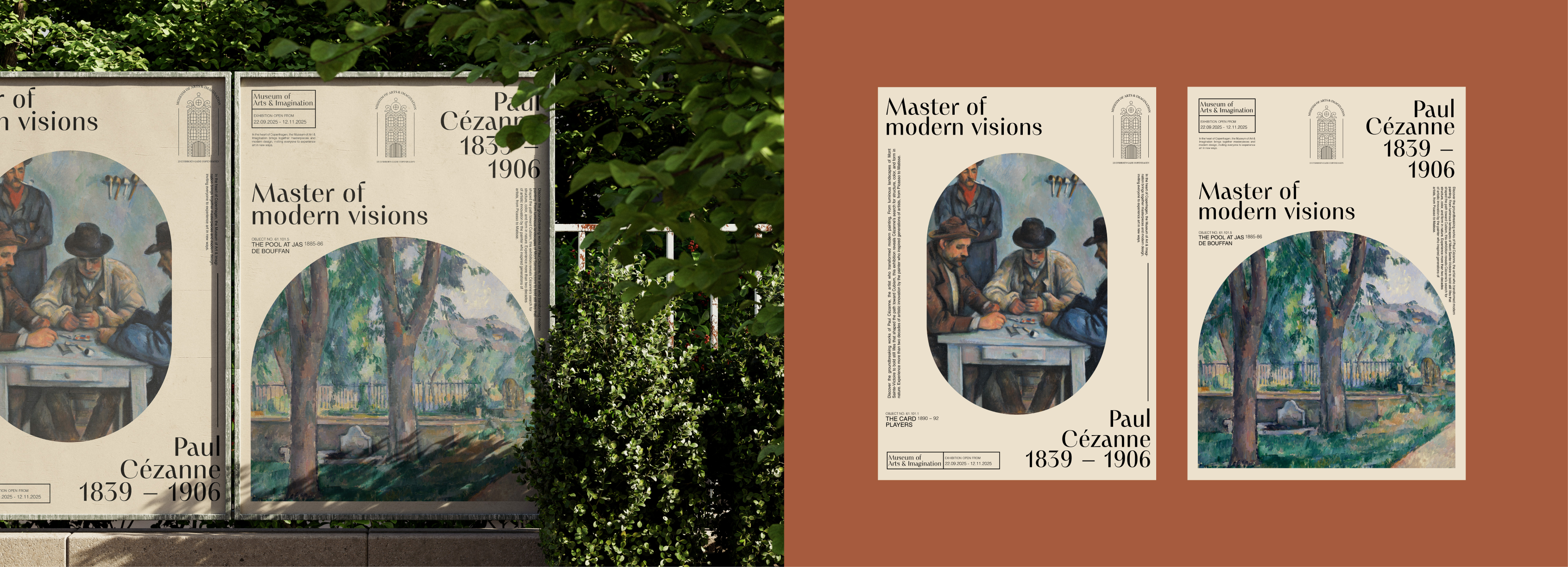
Two posters were created to promote the exhibition. The idea was that the posters could be placed in different locations around Copenhagen such as buss stations. They were designed in Illustrator, using the established graphic profile by applying the chosen typefaces. However, I aimed for a slightly more minimalist expression and therefore only used one of the colors as the background. Then I focused on form and the placement of text elements to make the posters dynamic and engaging. My intention was for the two posters to clearly belong together without being exact copies of one another.
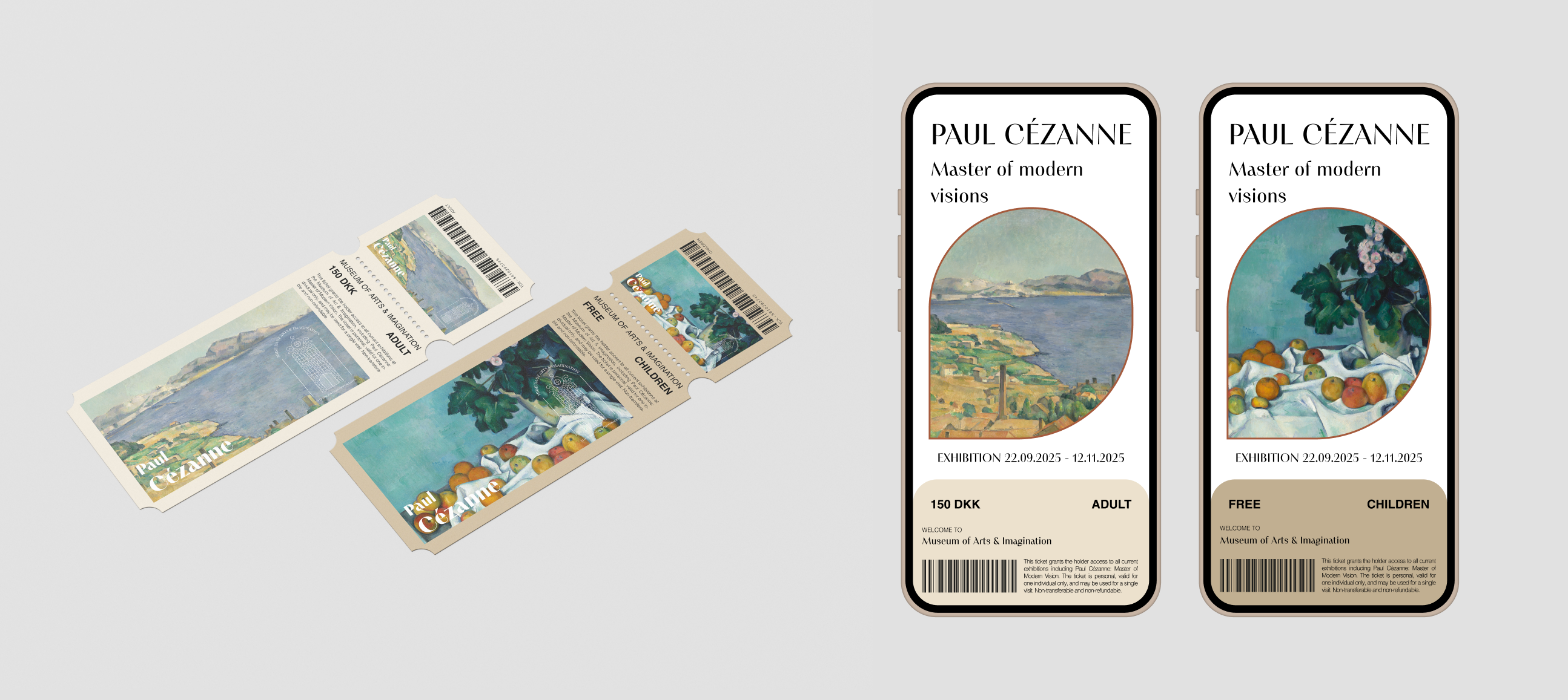
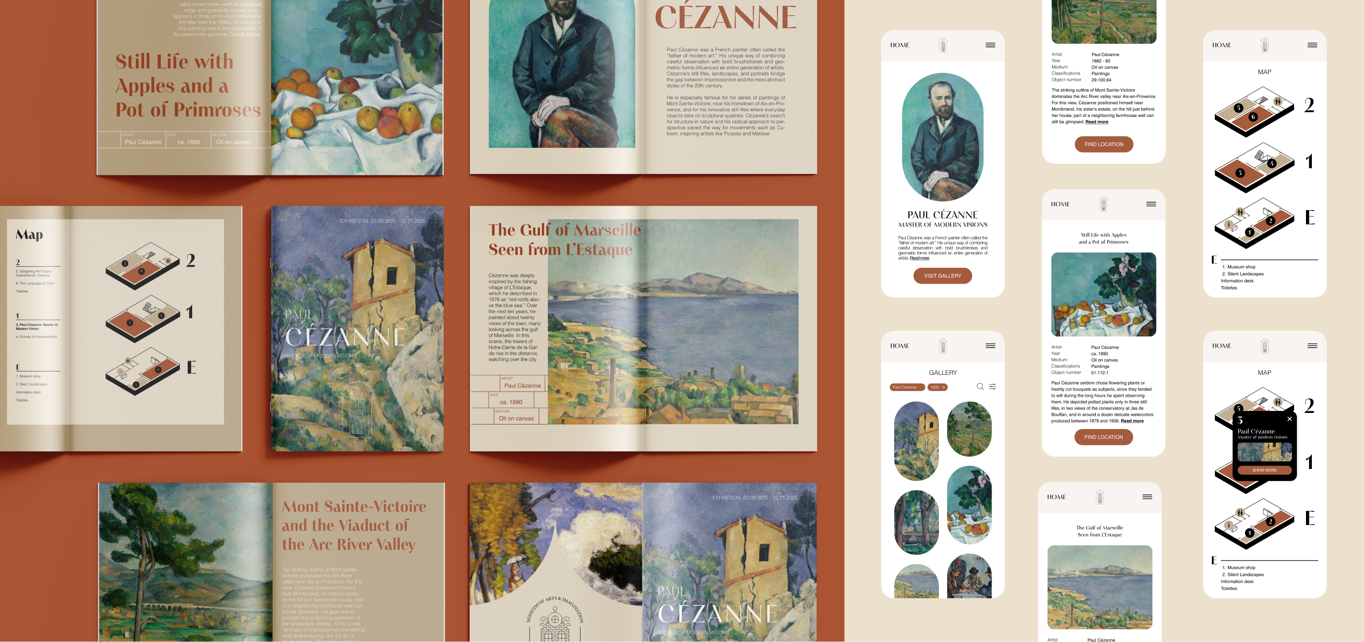
Even though physical tickets may no longer be used as frequently in the Nordic countries, I wanted to create one in order to reinforce the classical and traditional atmosphere. I began by designing a physical ticket in Illustrator, where I felt it was important to include one of Paul Cézanne’s artworks to create a sense of cohesion between the different exhibition materials. I used the same typeface chosen for the entire project and selected one of the colors as the background. I then designed an additional ticket intended for children, where I simply changed the background color and the artwork. Finally, I created a digital version of the ticket to be used on a mobile phone, using the same colors and artworks for each ticket, but with a more modern layout and overall expression.
A brochure was created to gather information about Cézanne, his artworks, and where visitors can find the exhibition. The first step was to design the physical brochure in InDesign. I began by selecting which artworks to include, based on how well they suited the graphical identity I had developed. I experimented with different layouts to create a cohesive impression, while still giving each page a unique design. My goal was to convey a classic expression with a modern touch. I also created a map of the museum in Procreate, using the narrow building on the logotype as inspiration for the floor plan. Once the physical brochure was completed, I designed a digital version. I chose to work in a mobile format, as it seemed the most practical option for visitors. For the digital brochure I reused the same elements, such as artworks and the map, but the design was kept more minimal and modern, with color used only as an accent to highlight buttons and interactive details.
The final design consists of a cohesive visual identity developed across both print and digital formats. Posters, brochures, and tickets were created to capture a classical museum aesthetic with a modern twist, while maintaining consistency through typography, color palette, and layout. The rounded shapes combined with sharp edges create contrast and bring vibrancy to the design. The digital components, such as the online brochure and ticket, were adapted to a mobile-friendly format with a more minimal and contemporary expression. Together the materials form a unified design language that reflects the timeless quality of Paul Cézanne’s art while ensuring accessibility and engagement for a modern audience.
The project allowed me to experiment with typography, color palettes, and layouts, as well as to consider how a consistent design language can be adapted across both physical and digital platforms. One challenge was to find the right balance between a timeless, museum-like aesthetic and a modern clarity that works across both print and digital formats. By experimenting with the design elements, I was able to materials that felt consistent yet adaptable for different media.

